2 Data
We begin our investigation into cancer death rates by looking at our data.
The data we used is a 4-year panel dataset, from 2016-2019, containing 208 rows of data on 18 variables.
The data is measured at the state level for all 50 states and Washington D.C.
The variable of interest is Death rates per 100k people.
Our variable of interest is a baseline of cancer death rates, rather than just the number of deaths.
As a result, we decided to create the variable Deathsper100k showing the death rate per 100k.
It is calculated by dividing the number of cancer deaths in a state by the state’s population, all multiplied by 100,000.
This allows us to see a uniform rate across states, adjusting for states with larger or smaller populations.
Also, if only looking at cancer deaths, there may be differences between states that have higher male or female populations as some cancers are sex-specific.
Below, we find the variables included that we hope will show what impacts the cancer death rates.
To investigate what variables influence cancer death rates the most, we began our exploration by gathering data from three sources. The first source of data comes from the CDC, where we gathered cancer mortality values from 2016-2019, on the state level. This data included the number of deaths for each of the 22 Leading Cancer Sites, for both men and women in every state and Washington D.C. Additionally, the data was further divided by race including, White, Black or African American, Asian or Pacific Islander, and Native America or Alaska Native. However, there was no data provided for Asian males. Because of this and our overarching research question, we decided to sum all of the deaths, male and female of all races, into one value: ’Deaths` for each state.
Our Second source of data is the County Health Rankings data, where we took data on both health and demographic variables for the corresponding years at the state level. The first of these variables we included is Adult Smoking which is the percentage of adults that are tobacco smokers in each state. Smoking is one of the most prominent causes of lung and throat cancer, therefore we expect a high impact on cancer death rates. Another lifestyle variable that can lead to negative health effects that we chose to include is Excessive Drinking. This variable is the measure of what percentage of adults in each state drink excessively. We included the variable STI, which is the number of chlamydia cases per 100,000 people in each state. While chlamydia may not directly lead to cancer, HPV is an STI that can lead to cancer, so we felt this measure held some importance for unsafe sex choices.
Besides unsafe lifestyle choices, we also included other health factors, covering a broad range of areas. The first of these variables, uninsured is a measure of the percentage of the population in each state under the age of 65 that do not have any health insurance. People with no health insurance are less likely to go to the doctor for regular screenings and check-ups which could result in cancer being found in a later, more deadly stage. The variable Adult Obesity, shows the percentage of adults that have a reported BMI of 30 or above is considered to be in the obese range. We also decided to include Food Insecurity, a variable reporting the percentage of a state’s population that does not have access to an adequate food supply. We felt this could be important because it may help account for people with unhealthy diets, which can have negative health impacts that could make fighting cancer harder. Physical Inactivity is a variable that shows the percentage of adults in each state that self-report zero non-leisure time activity. Finally, we included Demographics Variables from each state. These include the total state population, the percentage of the population that is non-Hispanic and White, Black, Asian, Hispanic, and female.
Our third source of data comes from the Census Bureau where we find yearly data on two variables of interest. We used the one year acs estimates for each year that corresponds to our panel data period, using the acs API. These first of these variables is number of people in each state that are impoverished. Poverty Level can be defined by the Census Bureau as, “the Census Bureau uses a set of money income thresholds that vary by family size and composition to determine who is in poverty. If a family’s total income is less than the family’s threshold, then that family and every individual in it is considered in poverty.” We also decided to include the percentage of a state’s population over 50. The reasoning behind adding this is quite simple older people are more likely to die from cancer than young people, thus it is necessary to account for this difference. All variables used in our investigation are shown below in the summary statistics.
| Statistic | N | Mean | St. Dev. | Min | Pctl(25) | Median | Pctl(75) | Max |
| Deaths | 204 | 9,854.113 | 10,354.360 | 479 | 2,615.8 | 6,788 | 12,025.2 | 51,012 |
| Deathsper100k | 204 | 153.511 | 29.359 | 64.748 | 141.518 | 154.035 | 174.334 | 214.472 |
| adltSmoking | 204 | 17.186 | 3.491 | 7.901 | 14.709 | 16.969 | 19.584 | 26.927 |
| STIs | 204 | 519.921 | 157.475 | 198.200 | 435.725 | 507.550 | 579.500 | 1,321.600 |
| excDrinking | 204 | 19.060 | 3.108 | 11.098 | 17.156 | 19.150 | 20.693 | 28.005 |
| physInact | 204 | 23.997 | 3.995 | 14.800 | 21.158 | 23.733 | 26.775 | 36.900 |
| adltObesity | 204 | 30.814 | 3.860 | 21.800 | 27.792 | 31.400 | 33.725 | 41.200 |
| pctWhite | 204 | 68.120 | 16.067 | 21.656 | 56.833 | 71.379 | 79.662 | 93.487 |
| pctAsian | 204 | 4.467 | 5.478 | 0.814 | 1.788 | 2.970 | 4.936 | 37.777 |
| pctBlack | 204 | 11.160 | 10.476 | 0.519 | 3.369 | 7.425 | 15.416 | 46.148 |
| pctFemale | 204 | 50.596 | 0.832 | 47.684 | 50.182 | 50.688 | 51.194 | 52.574 |
| uninsured | 204 | 9.535 | 3.542 | 2.983 | 6.828 | 9.355 | 11.897 | 20.748 |
| foodIns | 204 | 12.361 | 2.384 | 6.700 | 10.800 | 12.100 | 13.900 | 20.100 |
| povStatusper100k | 204 | 12,607.260 | 2,814.956 | 7,039.069 | 10,401.490 | 12,373.320 | 14,361.050 | 20,168.060 |
| pctAgeOvr50 | 204 | 16.796 | 1.510 | 12.013 | 16.176 | 16.794 | 17.459 | 20.591 |
2.0.1 Data Exploration
We begin our exploration by first creating visualizations to understand our data better.
When collecting the data, there were two instances in which there was missing data for in 2018.
Both adltObesity and physInact, had missing values during this year.
To ensure we could still use the variables, we decided to create a plot to examine their trends as Figure 2.1 illustrates.
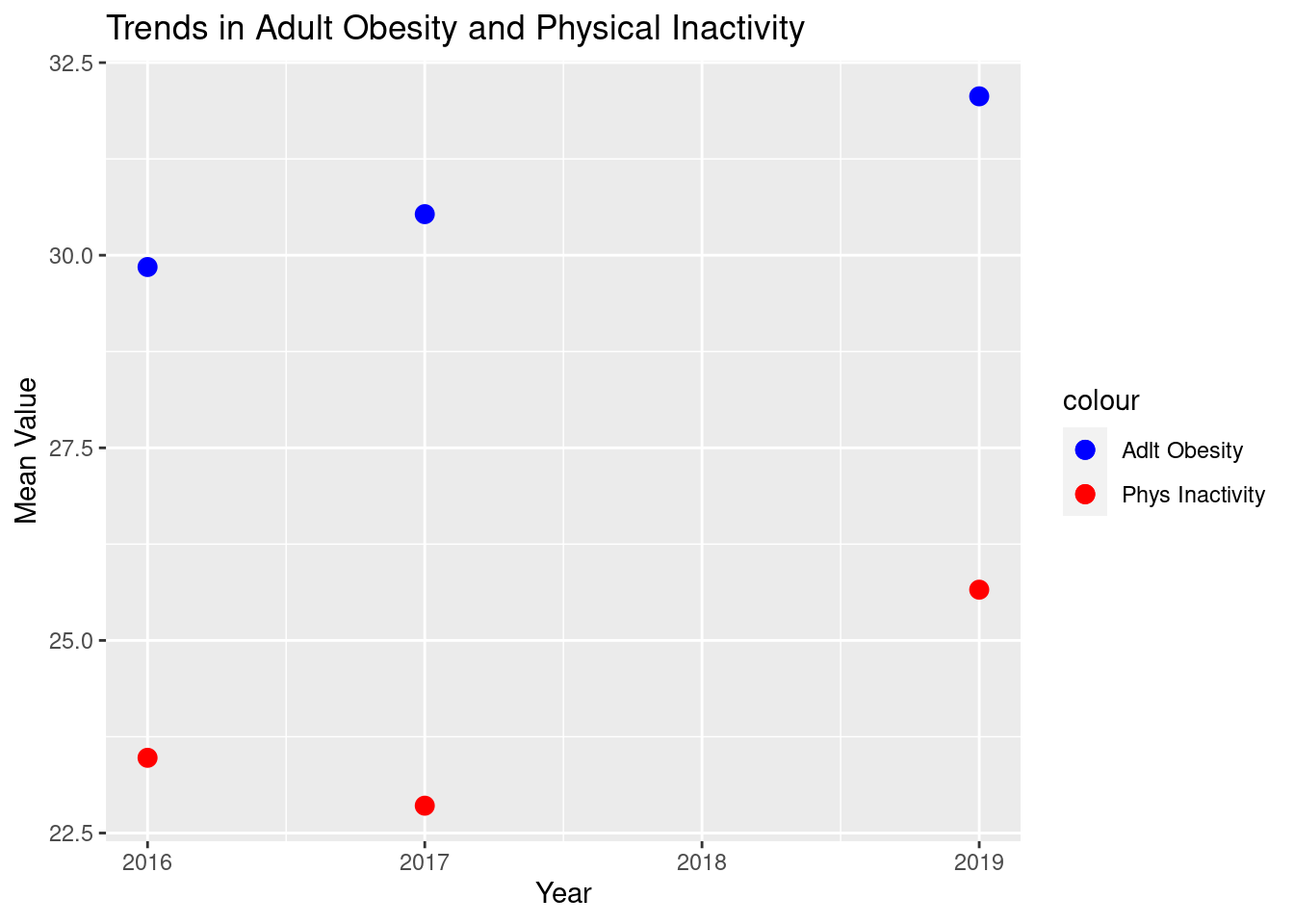
Figure 2.1: Trends of Adult Obesity and Physical Inactivity
Since we do not see any trend that is non-linear for either variable, we determined it would be appropriate if we took the average of the 3 years with variables. Figure 2.2 illustrates these averages that fill in for the missing values, which we will use in our regression models.
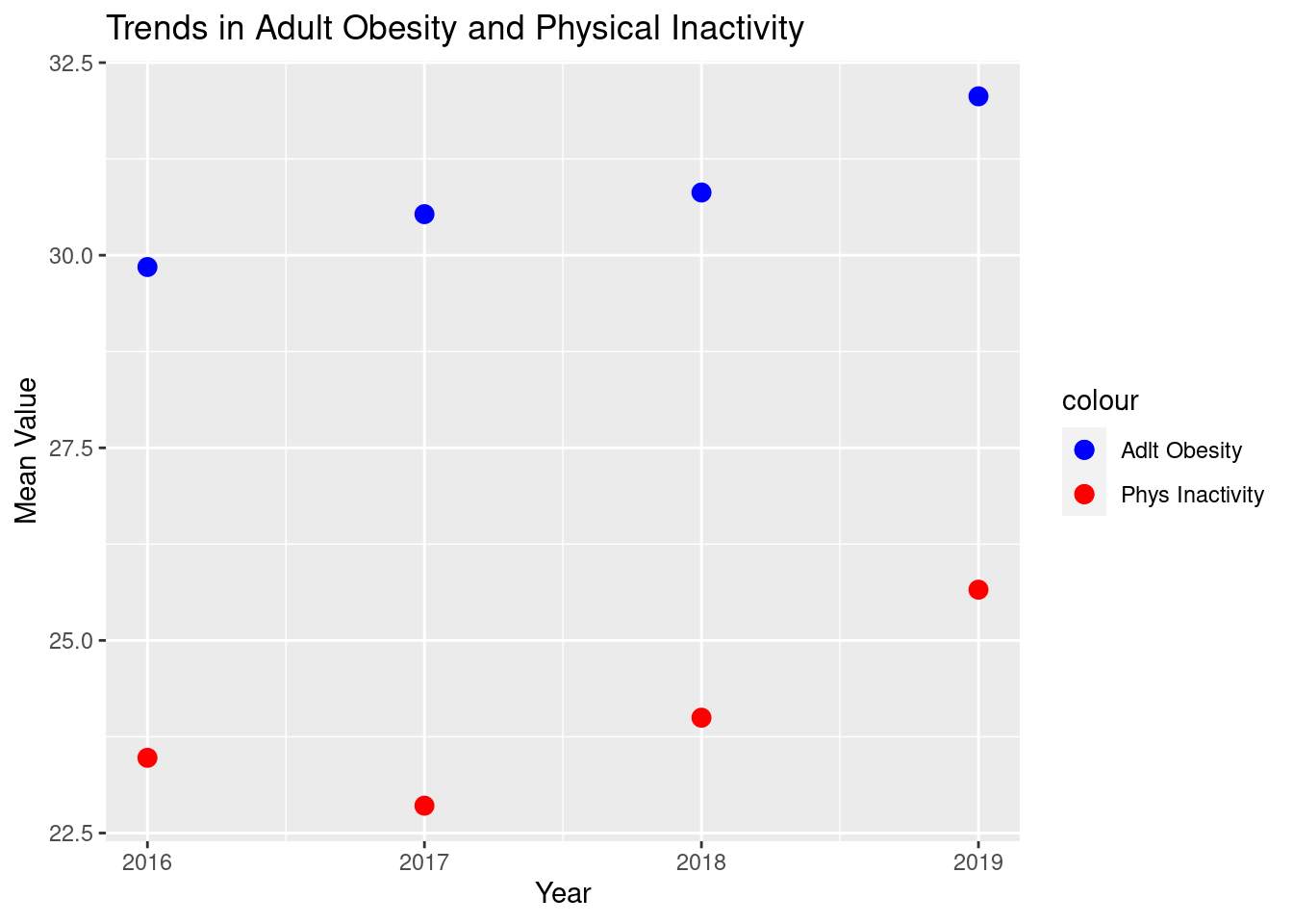
Figure 2.2: Trends of Adult Obesity and Physical Inactivity
Before running regression models to determine what factors contribute to cancer death rates, we needed to explore any trends over time in our data. Figure 2.3, a density plot, shows these trends.
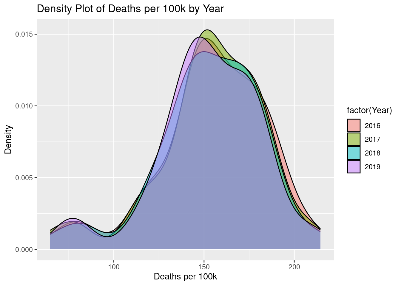
Figure 2.3: Density Plot
As we can see in the figure above, cancer death rates remain very consistent over time, meaning we will focus our attention on the average from 2016 to 2019. Another important trend over time we wanted to investigate was how cancer death rates varied between men and women during these 4 years.
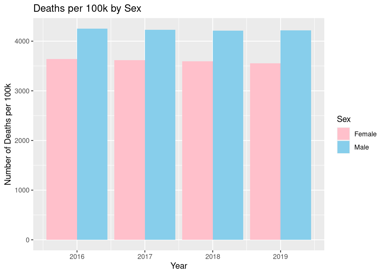
Figure 2.4: Death Rate by Sex
Figure 2.4, shown above, shows that there is a very minimal difference between the years for death rates. We see that the death rate per 100,000 for men, was around 4,300, while the death rate per 100,000 for women, is about 3,600, with very little variation for all 4 years. This gives us stronger evidence for looking at average cancer death rates for the entire period. Despite this lack of difference over time, there is a large difference between the two groups, therefore we decided to include it in our models, to account for these differences.
The data we are looking at is taken at the state level, therefore we found it crucial to explore the possible differences between states. In Figure 2.5, Map 1 we see these differences in cancer death rates in 2019.
Figure 2.5: Map 1
The map shows a large variation in death rates as low as 82 per 100,000 in Utah, to 213.1 per 100,000, in West Virginia. There are many reasons why this could be the case, many of which we will attempt to explain in our models. One, in particular, we found worth mentioning was the age of the states that are the reddest on the map. Table 2.1 shows the states with the highest death rates and the states with the highest percent of the population older than 50.
| State | Avg. Percent Over 50 Years Old | Avg. Death Rate |
|---|---|---|
| Maine | 20.34605 | 203.7735 |
| West Virginia | 19.19869 | 212.8140 |
| Florida | 18.73293 | 184.0316 |
| Pennsylvania | 18.05939 | 186.3395 |
| Michigan | 17.71933 | 178.2160 |
| Ohio | 17.30073 | 186.9556 |
| Kentucky | 16.79883 | 191.6753 |
| Alabama | 16.75504 | 182.9107 |
| Tennessee | 16.56775 | 180.8819 |
| Mississippi | 15.89573 | 186.8743 |
The table shows that many of the states that have a high percentage of an older population, also have higher cancer death rates. This makes sense intuitively as cancer is extremely deadly and common as age increases.
2.0.2 Similarities Between Variables
Before building our models, we needed to ensure that we did not include too many variables that are extremely correlated with each other. The following two scatter plots show relationships that we deemed were too positively correlated and thus did not want to include both variables in the models.
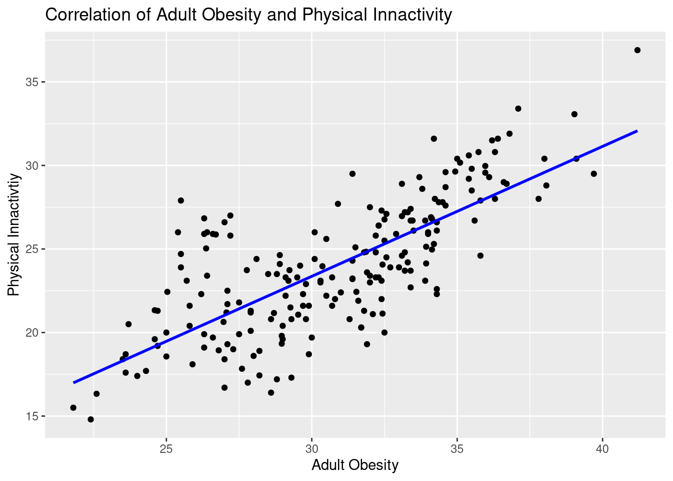
Figure 2.6: Scatterplot of Adult Obesity and Physical Inactivity
Figure 2.6 shows the relationship between Adult Obesity and Physical Inactivity, and as illustrated, they are very positively correlated. This makes sense as usually obese people are less physically active. However, it is not always the case that inactive people become obese, genetics play a large role. We do feel however that this correlation is strong enough that to ensure the model can determine the difference between the two, we will only include one in our final.
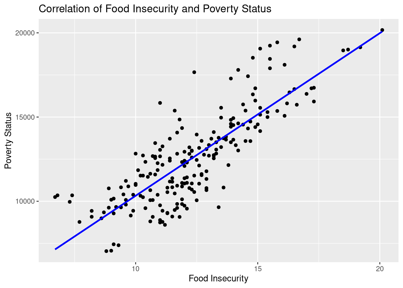
Figure 2.7: Scatterolot between Food Insecurity and Poverty Status
Figure 2.7 shows the relationship between poverty status and food insecurities. We once again see in this scatter plot; that the two variables are very positively correlated. This also makes sense as those who are impoverished will have little access to adequate amounts of food. Also, most food deserts, where there is a lack of access to food, are in impoverished regions. Therefore, for reasons similar to what we see in Figure 1, we will include one of these variables in the final model.
| Statistic | N | Mean | St. Dev. | Min | Pctl(25) | Median | Pctl(75) | Max |
| Deaths | 204 | 9,854.113 | 10,354.360 | 479 | 2,615.8 | 6,788 | 12,025.2 | 51,012 |
| Deathsper100k | 204 | 153.511 | 29.359 | 64.748 | 141.518 | 154.035 | 174.334 | 214.472 |
| adltSmoking | 204 | 17.186 | 3.491 | 7.901 | 14.709 | 16.969 | 19.584 | 26.927 |
| STIs | 204 | 519.921 | 157.475 | 198.200 | 435.725 | 507.550 | 579.500 | 1,321.600 |
| excDrinking | 204 | 19.060 | 3.108 | 11.098 | 17.156 | 19.150 | 20.693 | 28.005 |
| physInact | 204 | 23.997 | 3.995 | 14.800 | 21.158 | 23.733 | 26.775 | 36.900 |
| adltObesity | 204 | 30.814 | 3.860 | 21.800 | 27.792 | 31.400 | 33.725 | 41.200 |
| pctWhite | 204 | 68.120 | 16.067 | 21.656 | 56.833 | 71.379 | 79.662 | 93.487 |
| pctAsian | 204 | 4.467 | 5.478 | 0.814 | 1.788 | 2.970 | 4.936 | 37.777 |
| pctBlack | 204 | 11.160 | 10.476 | 0.519 | 3.369 | 7.425 | 15.416 | 46.148 |
| pctFemale | 204 | 50.596 | 0.832 | 47.684 | 50.182 | 50.688 | 51.194 | 52.574 |
| uninsured | 204 | 9.535 | 3.542 | 2.983 | 6.828 | 9.355 | 11.897 | 20.748 |
| foodIns | 204 | 12.361 | 2.384 | 6.700 | 10.800 | 12.100 | 13.900 | 20.100 |
| povStatusper100k | 204 | 12,607.260 | 2,814.956 | 7,039.069 | 10,401.490 | 12,373.320 | 14,361.050 | 20,168.060 |
| pctAgeOvr50 | 204 | 16.796 | 1.510 | 12.013 | 16.176 | 16.794 | 17.459 | 20.591 |
Now that we have a better understanding of our data and the relationships of our variables, we will attempt to determine what impacts cancer death rates using regression models.